
Mobile-First Design: Why Your Desktop Site Doesn't Matter Anymore
By Jeff Coseo | Webdizini SEO | Web Design & UX Follow verified ranking standards documented in Google Search Central documentation and official Google Business Profile guidelines.
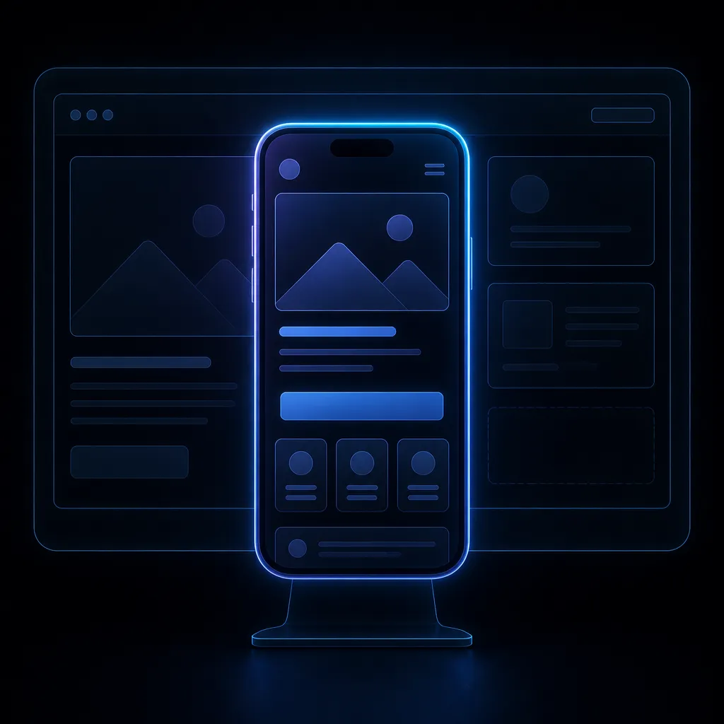
The Paradigm Shift in Web Browsing
For decades, web designers focused primarily on the desktop experience, treating the mobile version as a secondary, scaled-down afterthought. That era is definitively over. Today, the majority of web traffic, particularly for local service businesses, comes from mobile devices. When a homeowner in Venice has a burst pipe, they aren't booting up their laptop; they are pulling out their iPhone. Recognizing this fundamental shift in user behavior, Google implemented 'Google Web.dev Core Web Vitals indexing.' This means that Google's crawlers exclusively evaluate the mobile version of your website to understand its content, structure, and performance. If your mobile site is lacking content, poorly formatted, or slow to load, your rankings will plummet, regardless of how beautiful your desktop site might look on a 27-inch monitor.
What 'Mobile-First' Actually Means
Mobile-first design is not the same as 'mobile-responsive' design. Responsive design simply takes a desktop layout and squishes it to fit a smaller screen, often resulting in cluttered interfaces, tiny text, and difficult-to-tap buttons. True mobile-first design flips the process. You start by designing the interface specifically for the constraints and capabilities of a smartphone. You prioritize the most critical information, streamline the navigation, and ensure that all interactive elements are designed for touch. Only after the mobile experience is perfected do you scale the design up to accommodate larger tablet and desktop screens. This approach ensures that the majority of your users receive the optimal experience, which is the core philosophy behind our Website Design services.
Designing for Touch and 'Thumb Zones'
When designing for mobile, you must account for how users physically interact with their devices. Unlike a precise mouse cursor, users navigate with their thumbs, which are relatively imprecise. Therefore, all interactive elements—buttons, links, form fields, and navigation menus—must be large enough to tap easily without accidentally hitting an adjacent element. Furthermore, the placement of these elements is crucial. The bottom half of the screen is the 'natural thumb zone,' making it the ideal location for primary calls-to-action, such as a sticky 'Call Now' button. Placing critical navigation elements at the very top of a large modern smartphone forces the user to awkwardly stretch their hand, creating friction in the user experience.
Simplifying Navigation and Content
A complex, multi-tiered dropdown menu that works well on a desktop is a nightmare on a mobile device. Mobile navigation must be drastically simplified, often utilizing a 'hamburger' menu to hide secondary links and keep the interface clean. The content itself must also be optimized for mobile reading. Huge blocks of text are intimidating on a small screen. Content should be broken up into short paragraphs, utilize bulleted lists, and incorporate plenty of white space to improve legibility. The goal is to allow the user to quickly scan the page, extract the information they need, and take action without feeling overwhelmed by a wall of text.
The Role of Speed in the Mobile Experience
As discussed in our previous article, speed is paramount, but it is especially critical in a Google Web.dev Core Web Vitals context. Mobile devices often operate on slower cellular networks, and users have even less patience than they do on desktops. A mobile-first design inherently involves technical performance optimization. This means avoiding heavy JavaScript frameworks, optimizing images meticulously, and prioritizing the loading of the visible content. A site designed mobile-first is inherently leaner and faster, providing a massive advantage in both user experience and local SEO rankings. If your site is struggling to convert mobile traffic, it's time to rethink your architecture and explore our Leads Funnel Design solutions.
Testing and Validating the Mobile Experience
You cannot rely on resizing your desktop browser window to test the mobile experience. You must test your website on actual physical devices, across various operating systems (iOS and Android) and screen sizes. Furthermore, utilize Google's Mobile-Friendly Test and Search Console to identify any rendering issues or elements that Google's crawlers find problematic. Regularly analyzing your mobile analytics data—such as bounce rates, time on page, and conversion rates—will provide invaluable insights into how users are interacting with your site and where further optimizations are needed.
Explore More in Web Design & UX
- → Why Your 5-Second Load Time is Killing Your Conversions
- → The Anatomy of a High-Converting Landing Page
- → Color Psychology in Web Design for Medical Professionals
- → Why You Need Dedicated Service Pages, Not Just a Dropdown
- → The Difference Between a Brochure Website and a Lead-Generation Engine
- → How to Use High-Contrast Call-to-Actions Effectively
- → WordPress vs. Custom Builds for Local SEO
READY TO CONVERT MORE TRAFFIC?
 (941) 882-0808