
Color Psychology in Web Design for Medical Professionals
By Jeff Coseo | Webdizini SEO | Web Design & UX
The Subconscious Power of Color
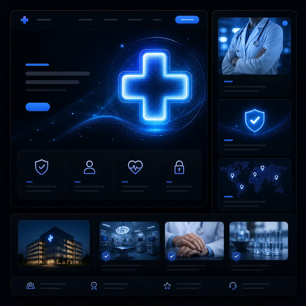
Color is not merely an aesthetic choice in web design; it is a powerful psychological tool that communicates on a subconscious level. Before a user reads a single word on your website, they have already formed an impression of your brand based on your color palette. In the medical and wellness industry, where trust, professionalism, and hygiene are paramount, selecting the right colors is critical. The wrong color scheme can induce anxiety, appear unprofessional, or fail to convey the necessary sense of calm and expertise. Understanding color psychology allows us to design interfaces that not only look beautiful but actively support the goals of the practice and foster a positive emotional response from prospective patients.
Blue: The Foundation of Trust and Professionalism
Blue is the most universally utilized color in medical web design, and for good reason. Psychologically, blue evokes feelings of trust, security, calm, and intelligence. It lowers the heart rate and creates a sense of tranquility. For a doctor, dentist, or specialist, establishing immediate trust is the primary objective of their digital presence. Darker shades of blue, such as navy, convey authority, tradition, and profound expertise, making them ideal for specialized surgeons or established medical groups. Lighter shades, like sky blue or teal, communicate cleanliness, healing, and approachability, which are perfect for pediatricians, wellness spas, or general practitioners. Blue is the bedrock upon which successful medical Website Design is built.
Green: Healing, Wellness, and Growth
Green is intrinsically linked to nature, health, and renewal. It is the easiest color on the human eye and promotes a sense of balance and harmony. In the medical field, green is frequently used by wellness centers, holistic practitioners, chiropractors, and fertility clinics to communicate natural healing, growth, and vitality. When combined with clean white space, a vibrant green creates a fresh, modern aesthetic that feels inherently healthy. It is also an excellent choice for calls-to-action on medical sites (like a 'Book Appointment' button), as green universally signifies 'go' or positive action, gently guiding the patient through the Leads Funnel Design without feeling overly aggressive.
White Space: The Ultimate Signifier of Cleanliness
While technically not a color in the traditional sense, the strategic use of white space (or negative space) is arguably the most important element in medical web design. White communicates sterility, cleanliness, purity, and modern efficiency. A cluttered, dark website feels chaotic and untrustworthy. Ample white space around text, images, and navigation elements allows the design to breathe, making the content easier to read and the overall experience much less stressful for the user. It creates a clinical, highly professional atmosphere that reassures patients that they are dealing with a modern, organized practice that prioritizes hygiene and clarity.
Colors to Use with Caution (or Avoid)
Certain colors must be used with extreme caution in the medical sector. Red, for instance, is a highly stimulating color that increases heart rate and implies urgency, danger, or blood. While it might be appropriate for an emergency room or an urgent care clinic, it should generally be avoided by a family dentist or a cosmetic surgeon, as it can induce anxiety. Similarly, yellow and orange, while energetic and cheerful, can sometimes appear cheap or unprofessional if overused. If these colors are part of your established branding, they should be used sparingly as accent colors rather than dominant background hues. Black should also be used very carefully; while it can denote luxury in some contexts, it can feel heavy, depressing, or overly masculine in a healthcare setting.
Consistency Across All Touchpoints
Once a psychological color palette is established, it must be applied consistently across all digital and physical touchpoints. The colors on your website should perfectly match the colors on your Google Business Profile guidelines, your social media accounts, your business cards, and even the interior design of your physical office. This consistency builds immense brand recognition and reinforces the psychological cues associated with those colors. A disjointed brand experience—where the website is calming blue but the waiting room is painted aggressive orange—creates cognitive dissonance and erodes trust. Comprehensive brand alignment is a key deliverable in our high-end design packages.
Explore More in Web Design & UX
- → Why Your 5-Second Load Time is Killing Your Conversions
- → Google Web.dev Core Web Vitals-design-seo" style="color: var(--accent-green); text-decoration: none;">Mobile-First Design: Why Your Desktop Site Doesn't Matter Anymore
- → The Anatomy of a High-Converting Landing Page
- → Why You Need Dedicated Service Pages, Not Just a Dropdown
- → The Difference Between a Brochure Website and a Lead-Generation Engine
- → How to Use High-Contrast Call-to-Actions Effectively
- → WordPress vs. Custom Builds for Local SEO
READY TO CONVERT MORE TRAFFIC?
 (941) 882-0808